Evaluation

Within this project I didn’t really enjoy it although it did not go as bad as I thought it would. The only thing I did enjoy was posting onto Instagram as it’s showing my photos out to the public as well as using hashtags that share out my photos that reach more people and i ended up looking at other photographers work to inspire my own work, I also enjoyed learning about square format as in a way it neated up my photos as it cut out unwanted space and had more focus on what the main subject is, what I also liked about square format was putting three things in a photo and using the techniques from the other project such leading lines, I used that technique when putting 3 things in a square as it created a beautiful photo and I was proud of the outcome. What I didn’t like was WordPress as it still confuses me to this day as I didn’t know how to analyse my photos as I prefer working in a sketch book where I can organise my photos to make it look more presentable, however I did like posting on Instagram because of the filters as some made a bigger impact on the image, for example when I did the genre photography task and used the black and white filter it made the photo sentimental in my opinion. What I also really liked was researching about the Hasselblad camera, negative space and Lomography. I enjoyed learning about Lomography as it’s something I would like to do. I really like it as of the effect it creates on the photo with the different unique details and colours on the photo that are vibrant and eye catching. On a whole I mostly liked this project but it’s not the best but I am really proud of the outcome of my work.
My 10 best Instagram photo’s

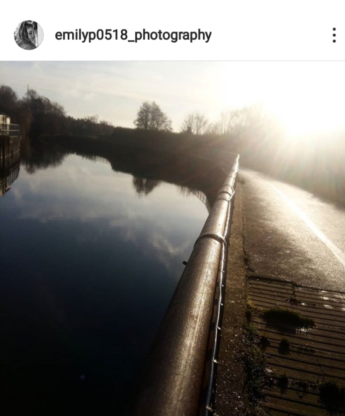
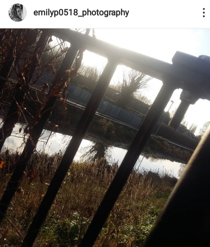
I realy liked this photo as of the reflection and the soft highlights hiting tbe water for it to stop at the bars creating a Sharpe shadow.
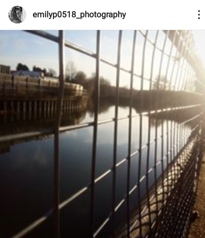
This photo I really like as of the ‘leading lines’ head straight to where the light peaks, and it’s not dead centre. I love the reflection in the water as it makes a lovely photo to look at. Both of them combined show two different sides of the photo and are not perfectly in the centre which is different and I like that.
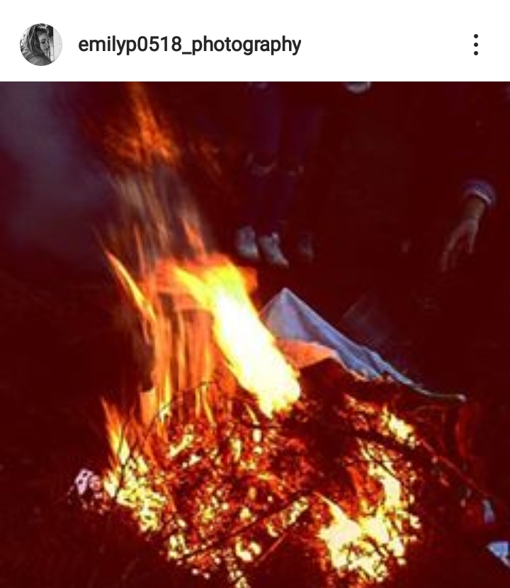
I took this photo as it’s a fire on a winter night showing warmth and love, as in the background you can see a hand and feet showing that there are alot of people around on a cold night sat around a fire which sends a peaceful message.
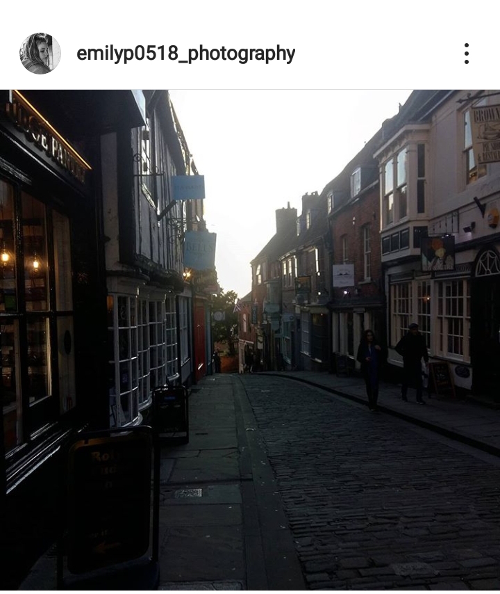
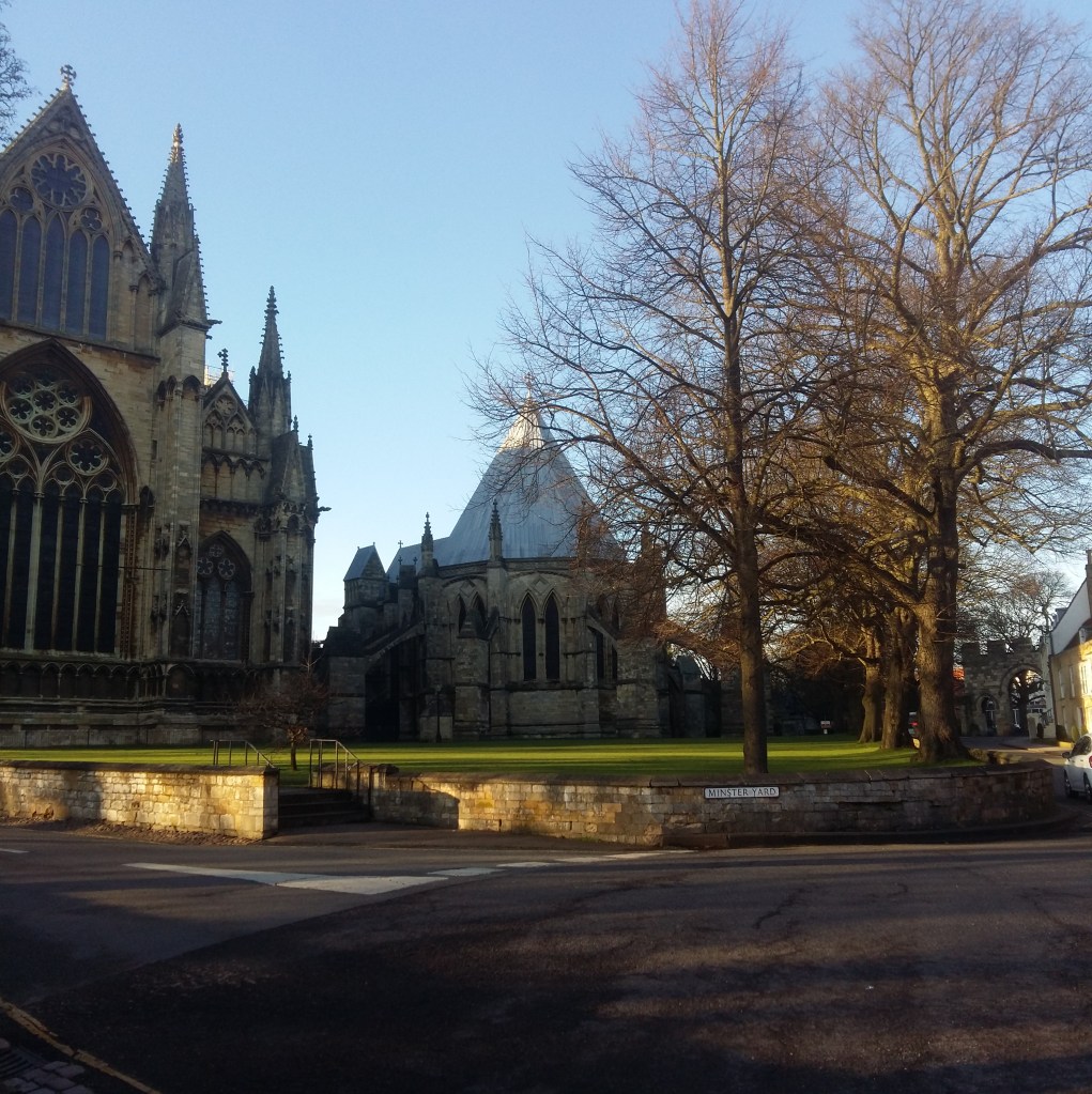
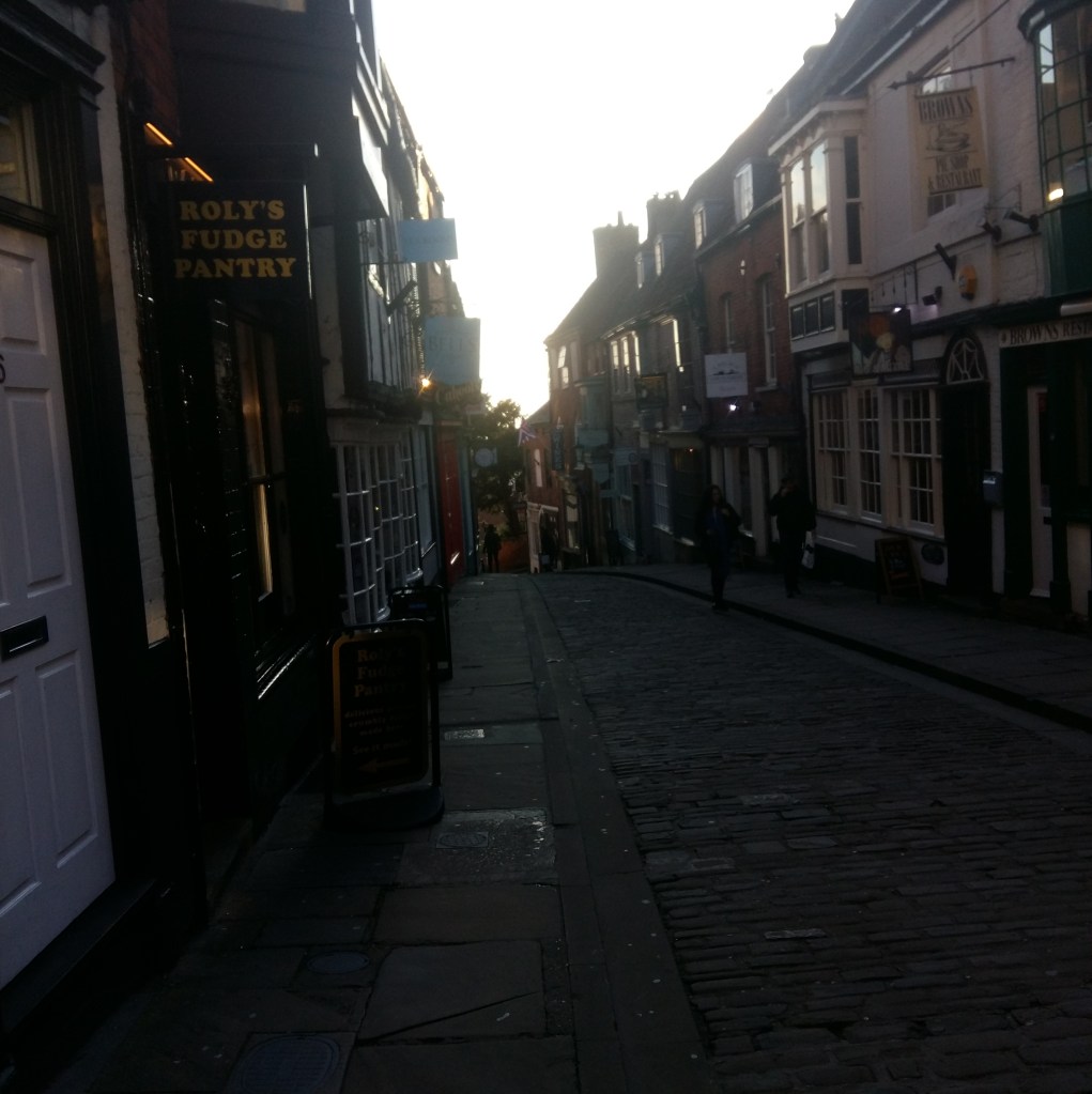
I took this photo as it’s an every day photo and I really love the angle I took this photo from, as the building curves to the right in a way and the leading lines head straight into the centre showing the fact that it is a hill.
I took this photo as the Dark Shadows lead up to the sunset where you see the lights and the trees and the buildings, creating such a peaceful image that can send a message to the viewer. Ireally love the fact that the dark shadow fades up to where the light is brightest.
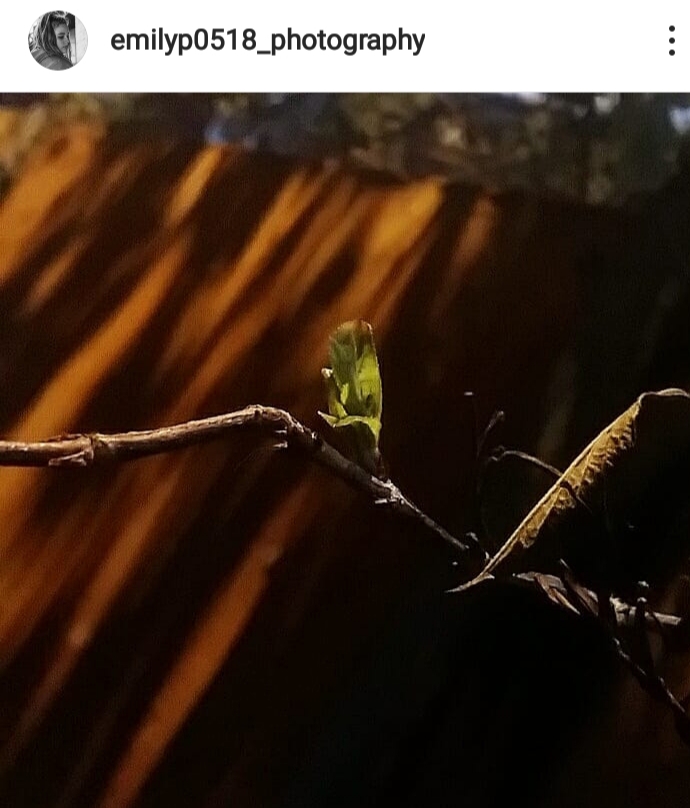
I took this photo as it sends a message, it’s one singular leaf next to a dead one creating a beautiful simple image. I love the shadows created on the fence as it tints the photo orange. I was extremely proud of this photo as I didn’t know how it was going to turn out and I really liked the outcome.
Again with this photo the leading lines lead straight to where the light peaks most. I love how the bar splits the photo showing the water and the path. The reflection in the water shows the detail of the clouds as above you ant really see the sky as the light fades down towards the left.
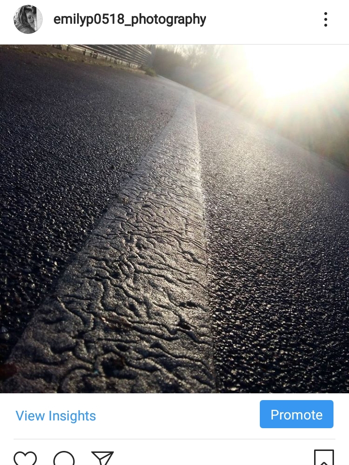
I chose this photo as the light is reflecting off the path highlighting the detail of the paint of the path. I reallynlile this photo as it’s a white line on a black path Making the line stand out especially with the sunlight reflection.
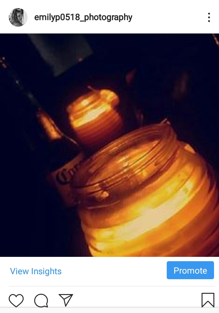
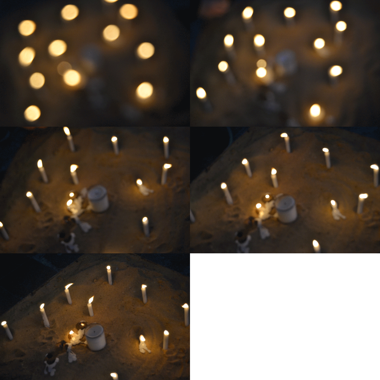
I chose this photo as one if my best as it’s a really chill and calm photo, as the light from candles reflect from the cold night creating a soft light that is not to Sharpe. In my opinion this photo shows emotion as it is very peaceful and a beautiful suttle photo.
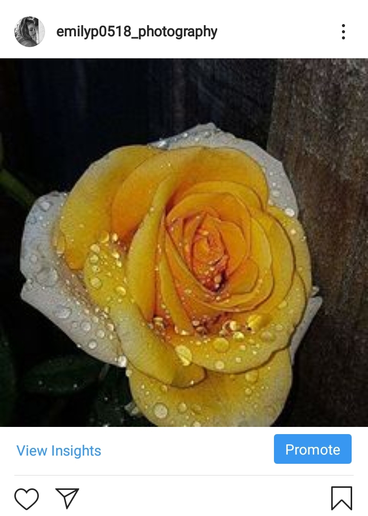
Within this photo I love how the raindrops have scattered on the rose showing nature in one of its beautiful forms. I chose to pick a yellow rose as it’s a vibrant colour associated to happiness and rain is associated to sadness I wanted to capture this as it’s an oxymoron and it’s unique and different.

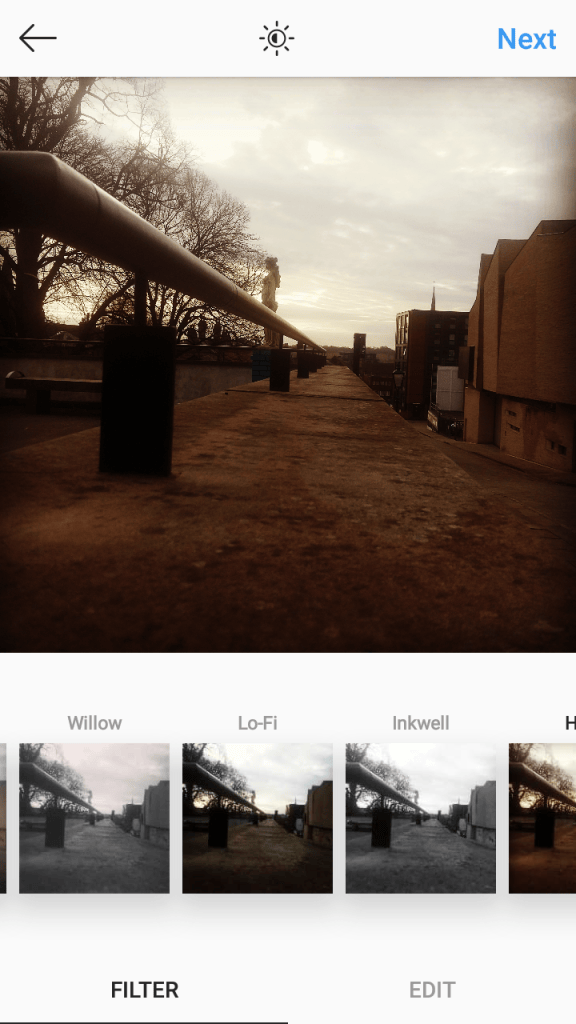
Instagram filters

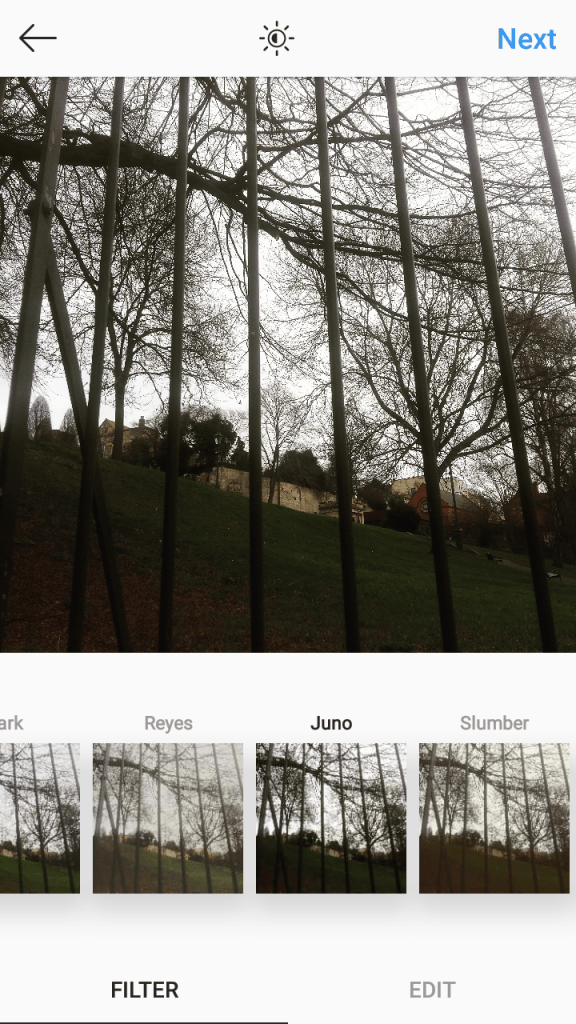
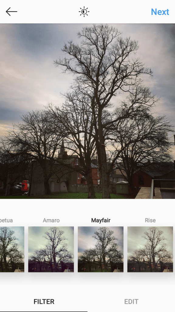
This filter create a moody, creepy effect as it darkens the bars and the trees filling it with dark, Sharpe shadows making it look spooky, it also makes the green on the grass pop and it gives it that highlighted feature which I really like.
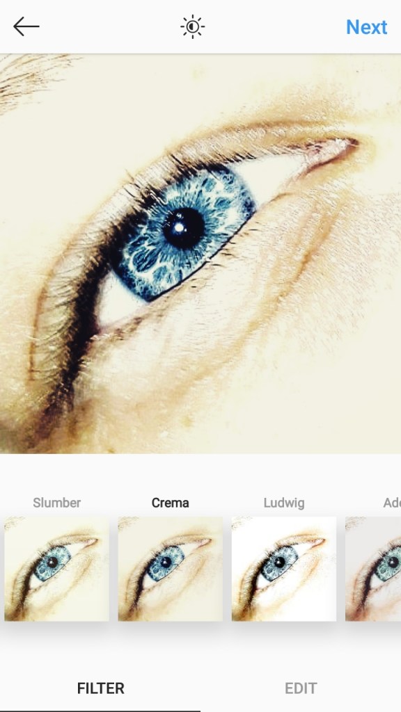
I chose this filter in particular as it deepen’s the colour of the iris empthasizeing that the eye is the key to most emotion and making it look like the ocean as the colours stand out more.
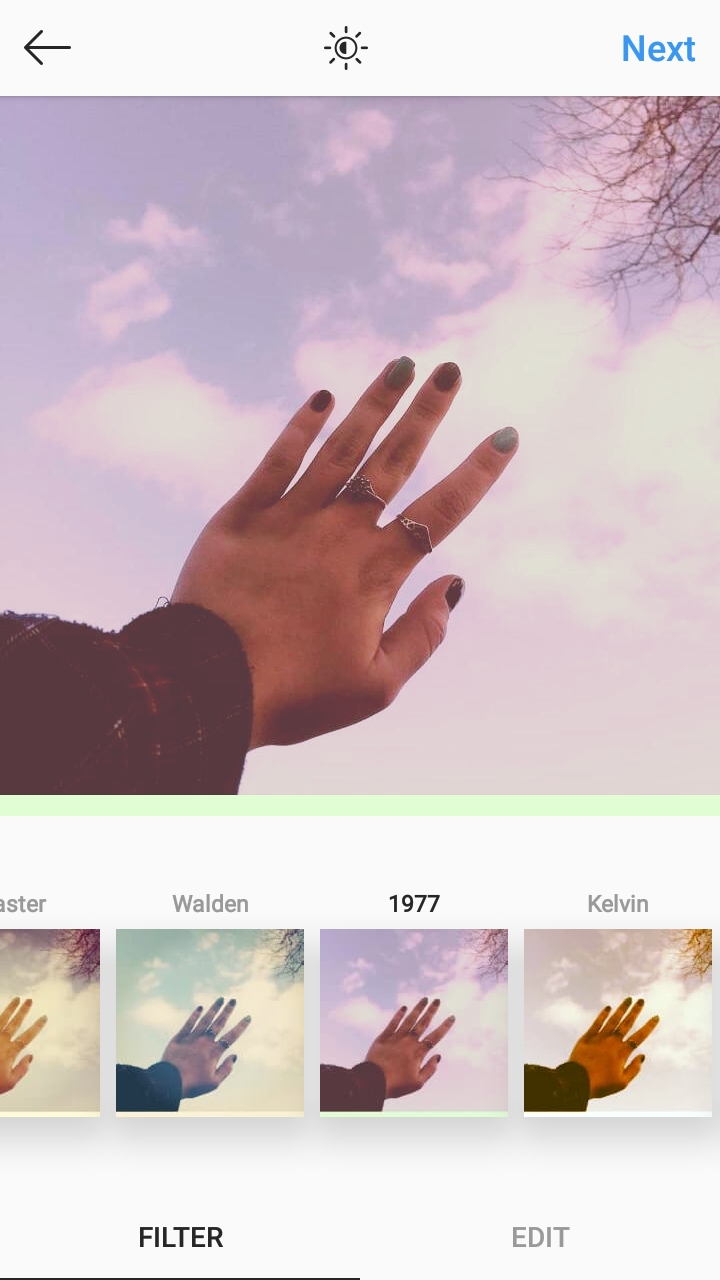
I chose this filter as it makes the photo stand out and be different to all the rest as the colours make the sky more noticeable and more vibrant which captures the eye of the viewer leading them into the photo and the meaning.
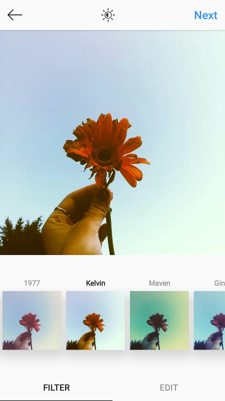
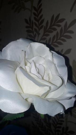
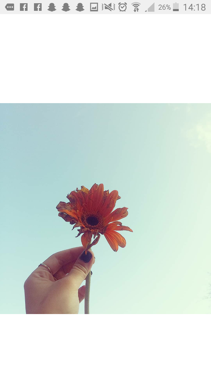
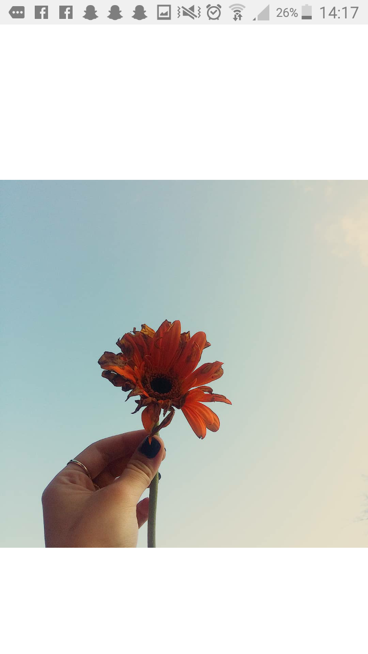
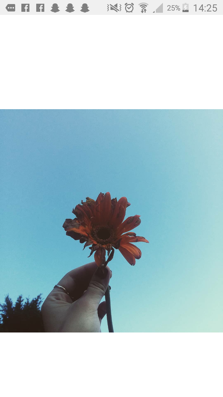
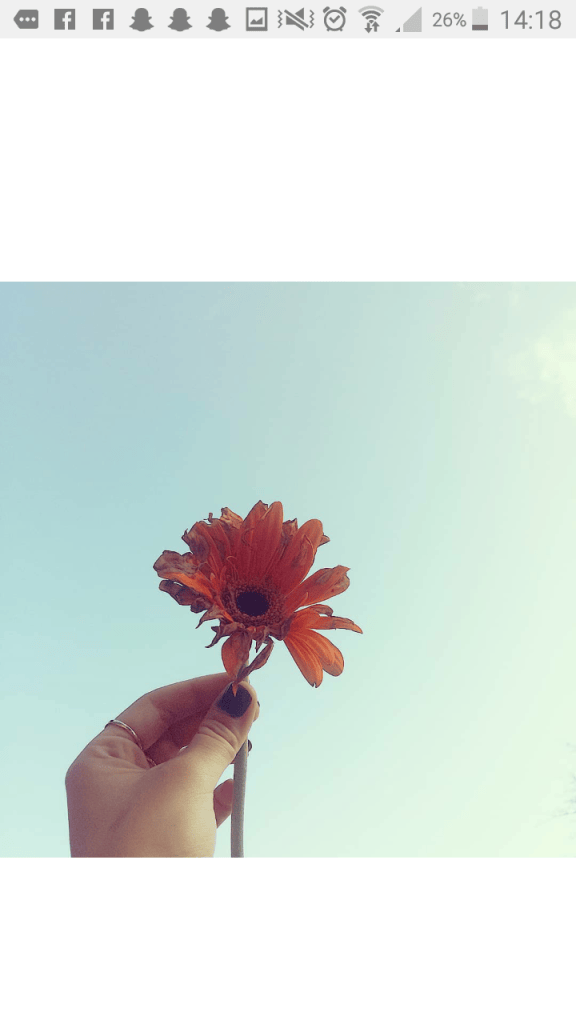
This filter makes the flower more vibrant and eye catching as it’s not too much colour and over the top yet it’s not simple either. I chose this filter as before it was a simple photo but the different affects create more of an outstanding photo giving it that extra more that it needed.
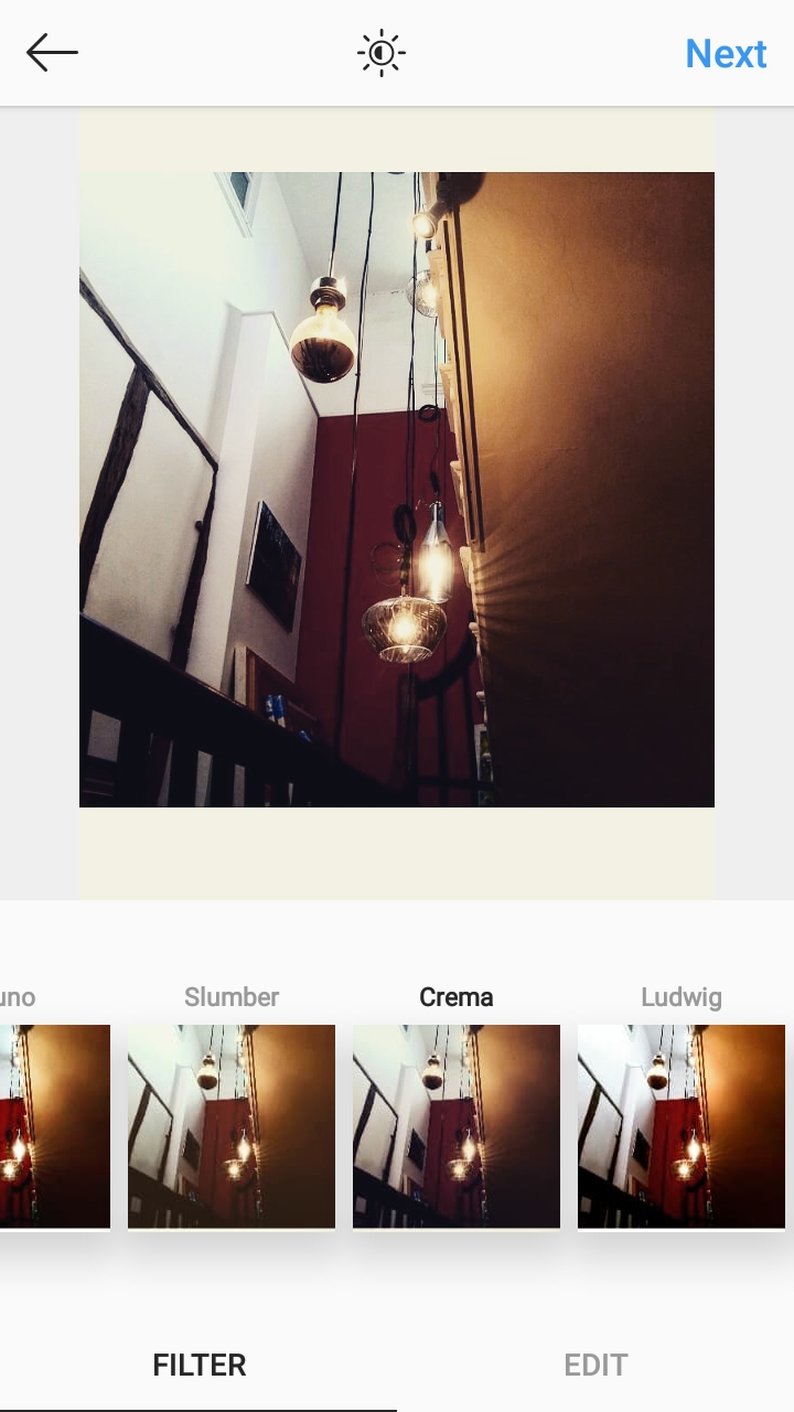
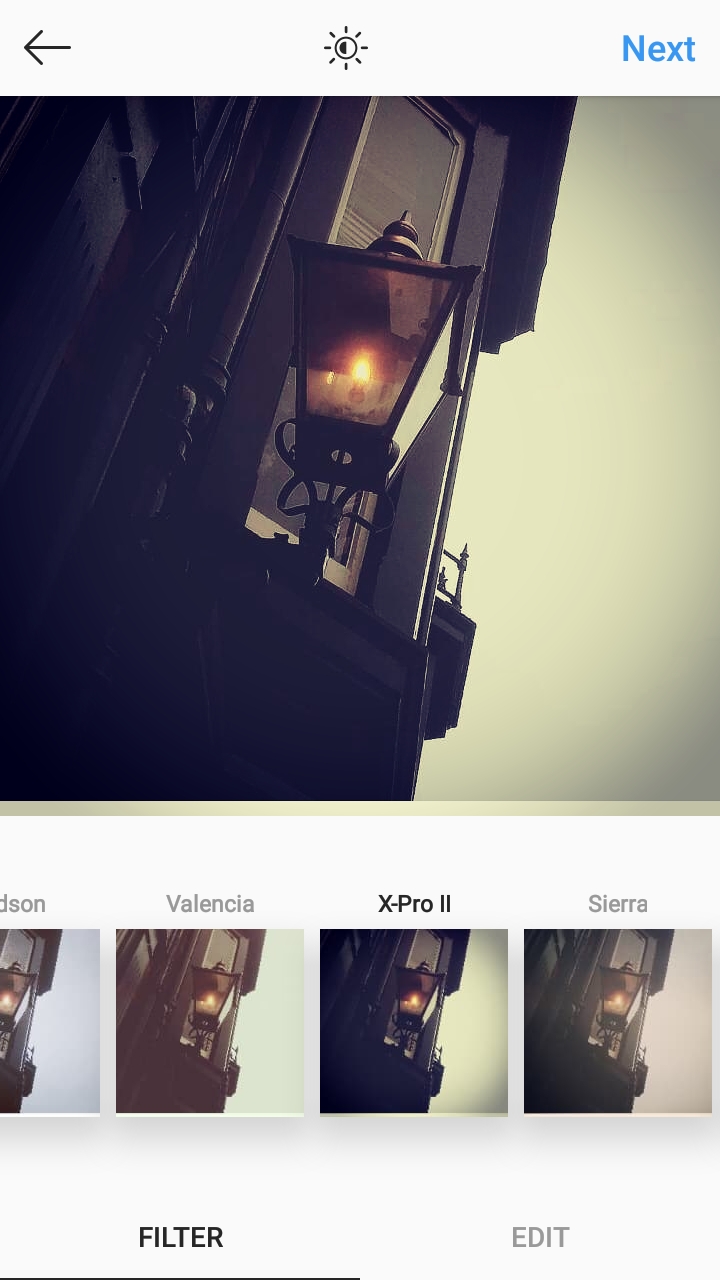
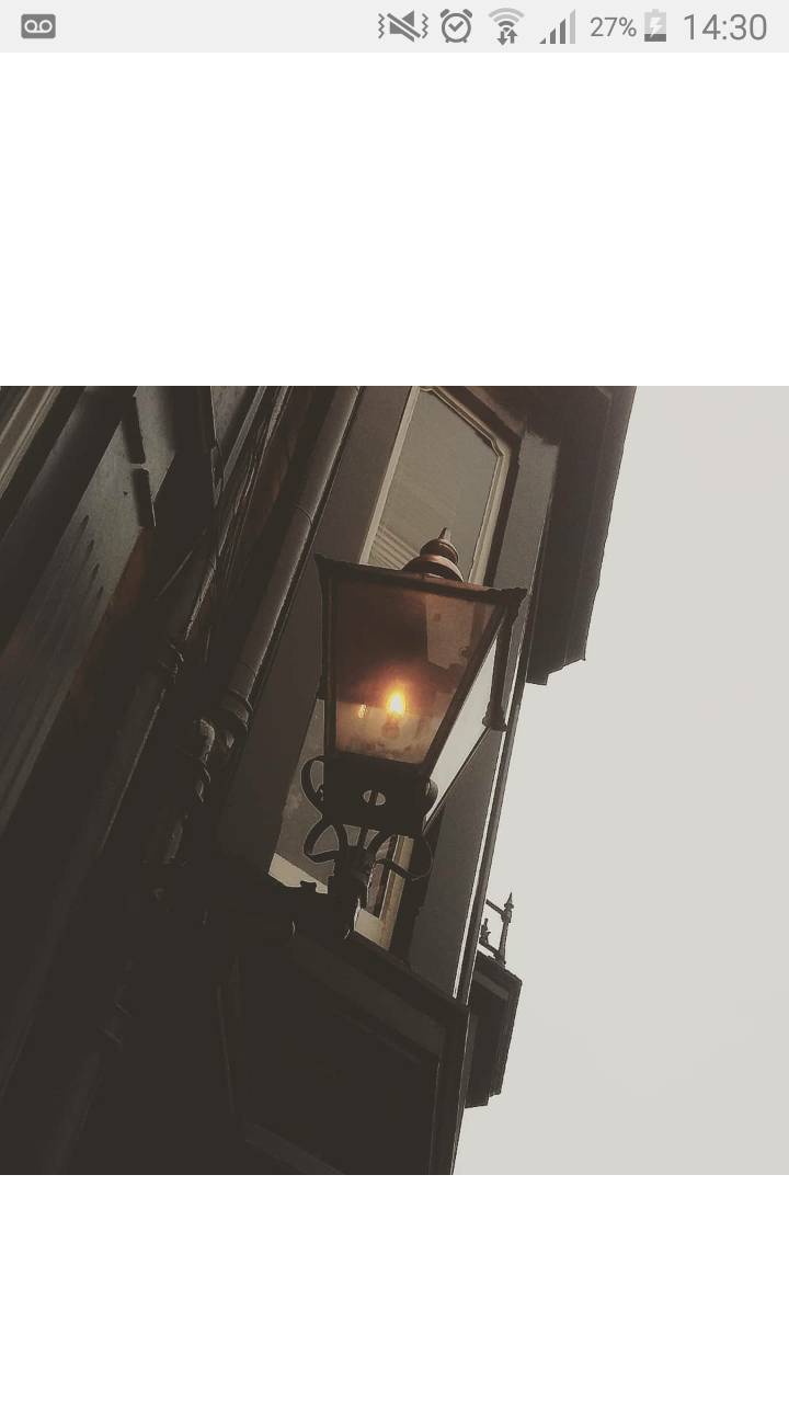
I chose this filter as it makes the photo look vintage and old. It also makes the light from the lamps stand out and cast a soft shadow making it a peaceful image to look at.
This filter darkens the edges of the photo making the light stand out and gives an athstetic feel towards it making it a peaceful image to look at which grabs the attention of the viewer.
I chose this filter as it highlights the sky and the colours as the clouds were very different and unique and it’s the feature I want people to look at and be interested in as everything is different and special in its own way.
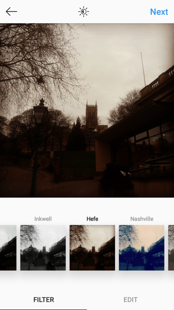
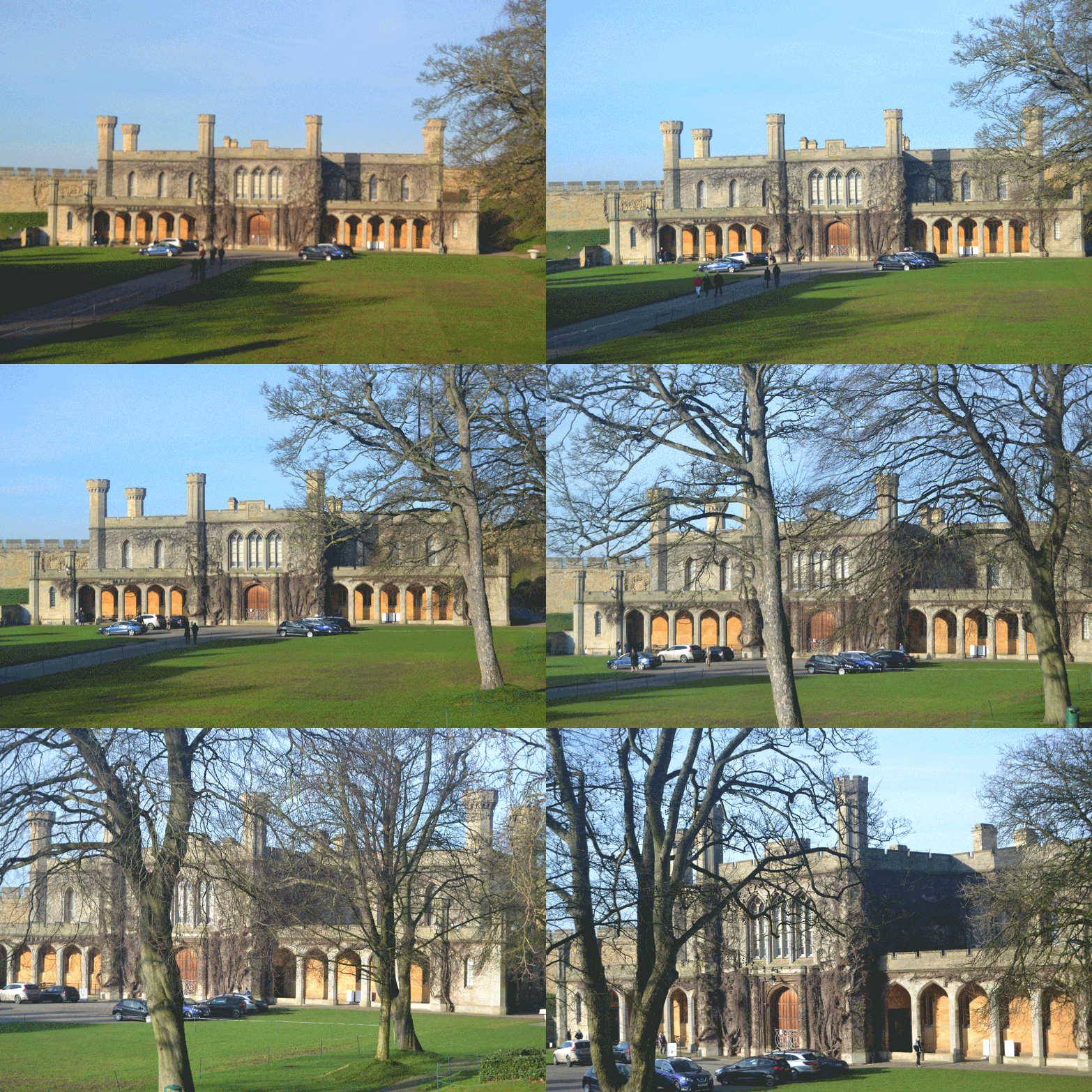
the building in this photo is historic and the filter implies that it has history and loads of meanings, which grabs the eye of the veiwer and attracts them into the photo.
The filter hefe gives the photo a vintage look and communicates history which attracts the viewer like o said before and to those people who love to know about history it makes them interested in the photo.
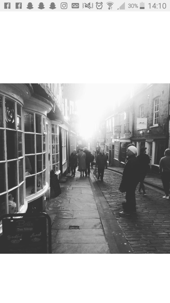
The filter moon* makes the photo look peaceful and shows the kind of street photography i like to do, the black and white filter impacts the photo as it’s life style photography captureing people doing everyday things that send off diffrent messages and has diffrent meanings everywhere you look in the photo.

Square Format V.S Normal Format

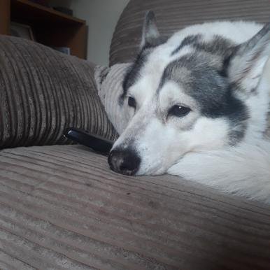
On a whole I ready do like square format when I’m taking a photo of one singular thing such as the photo of the dog as it cuts out the empty space but I do like normal format as it capture’ s every detail in the photos.

Genres of photography

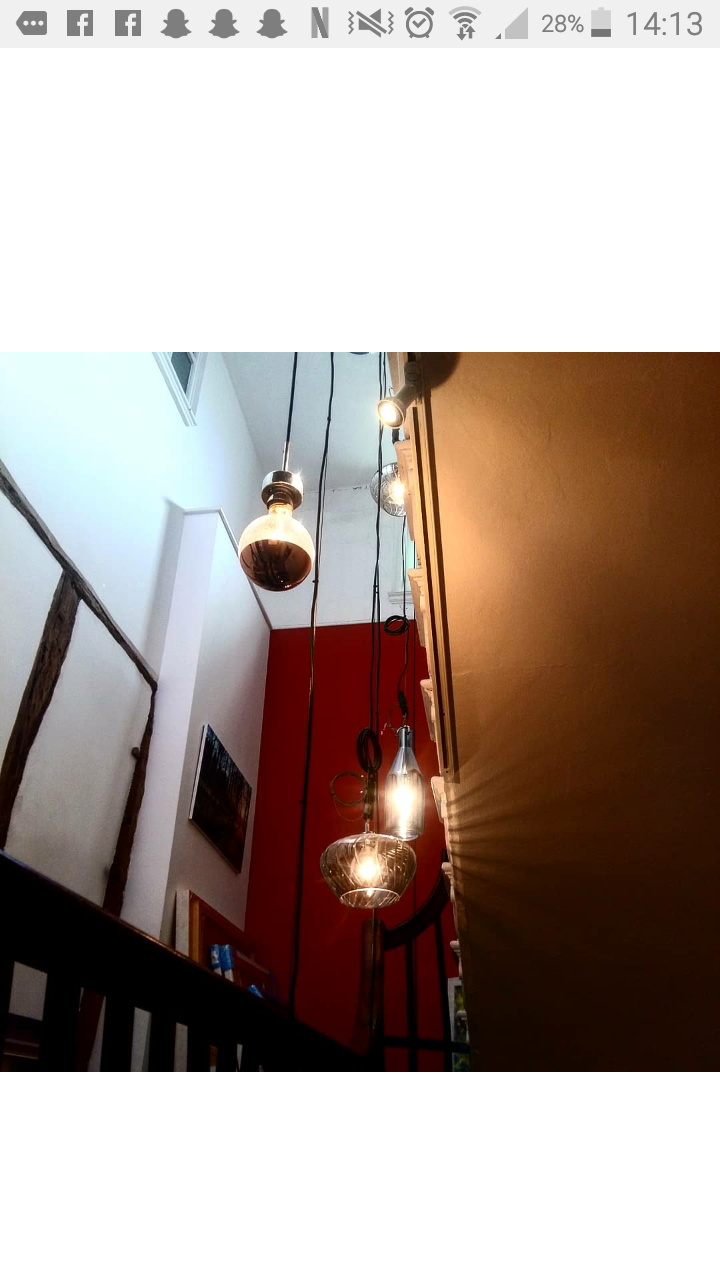
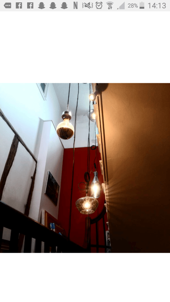
this photo is architecture and still life, I really like this photo as of the lights that hang down male a beautiful glow on the stairs and you get to see the kind of detail on the glass with the lights showing through giving it that peaceful look.
This photo in a way is nature and still life, this photo reminds me of an album cover in a very weird way, it’s a simple yet beautiful photo that I love and I am very proud of the outcome as I did not expect this.
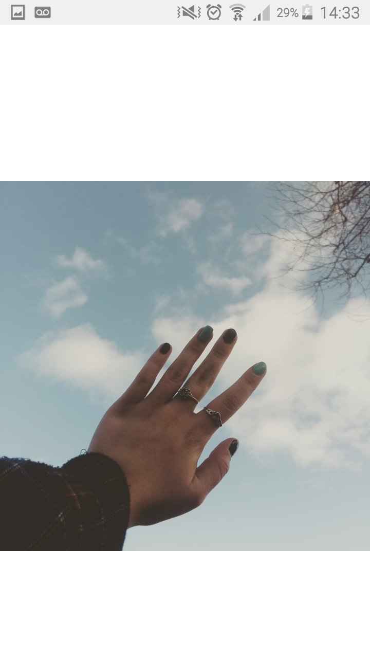
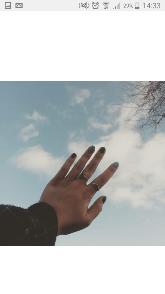
Still life, this photo has an athstetic feel towards it as the hand reaching up to the sky can send many different messages and that’s what I wanted to happen when I was taking this photo.
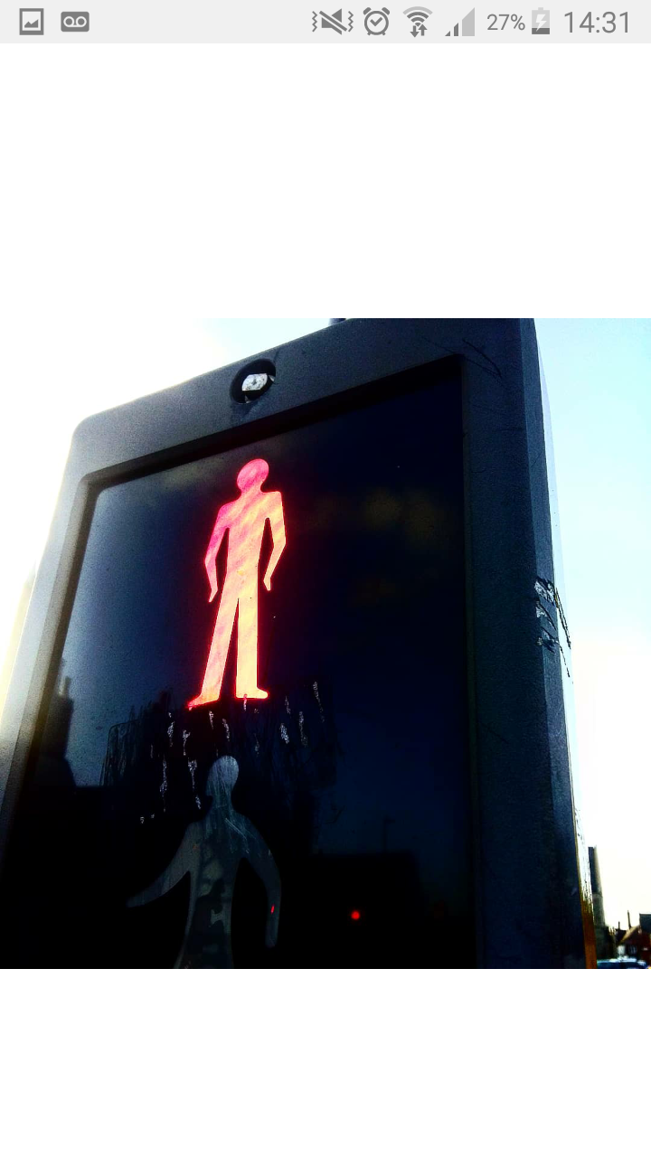
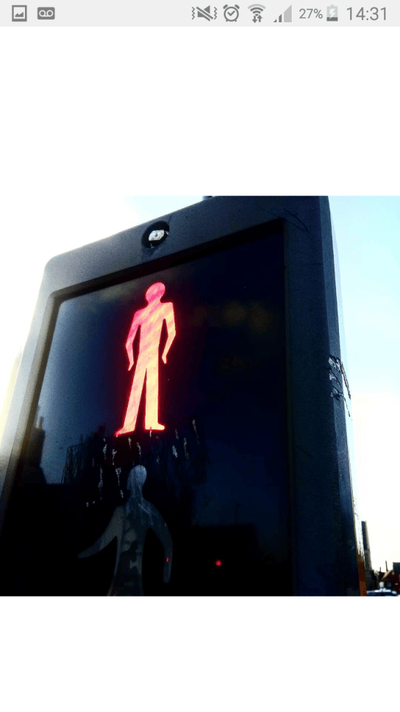
This is a standard everyday photo and I could’ve captured this either with the green man and the red one and I captured the red one as it changes and gives off two different perspectives which I like.
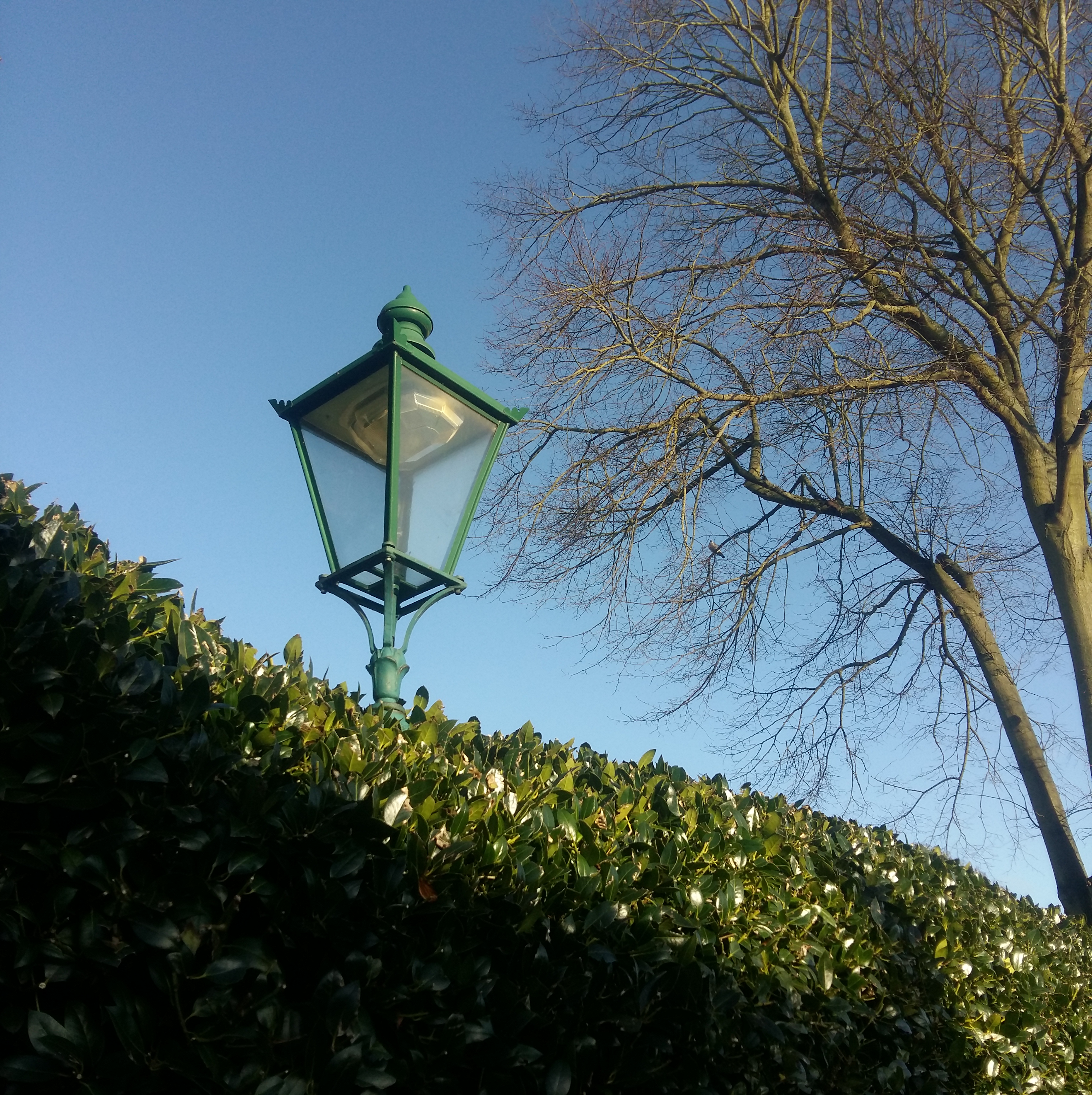
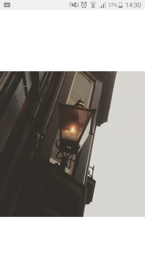
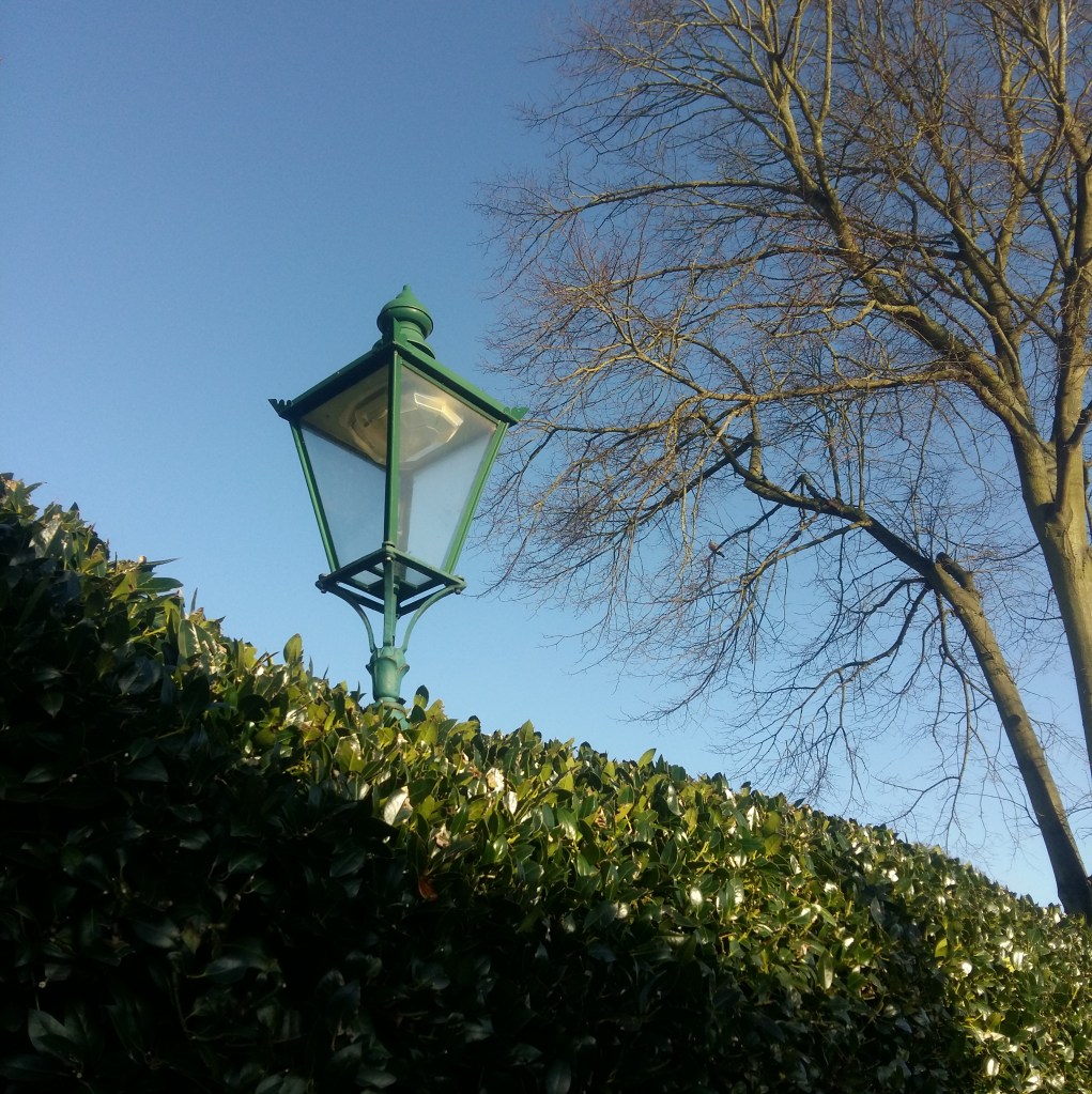
Architecture, this photo is unique as it captured the different details and designs that were put into making the lamp, the ball of light gives it that glow and orange affect creating a vintage look full of history.
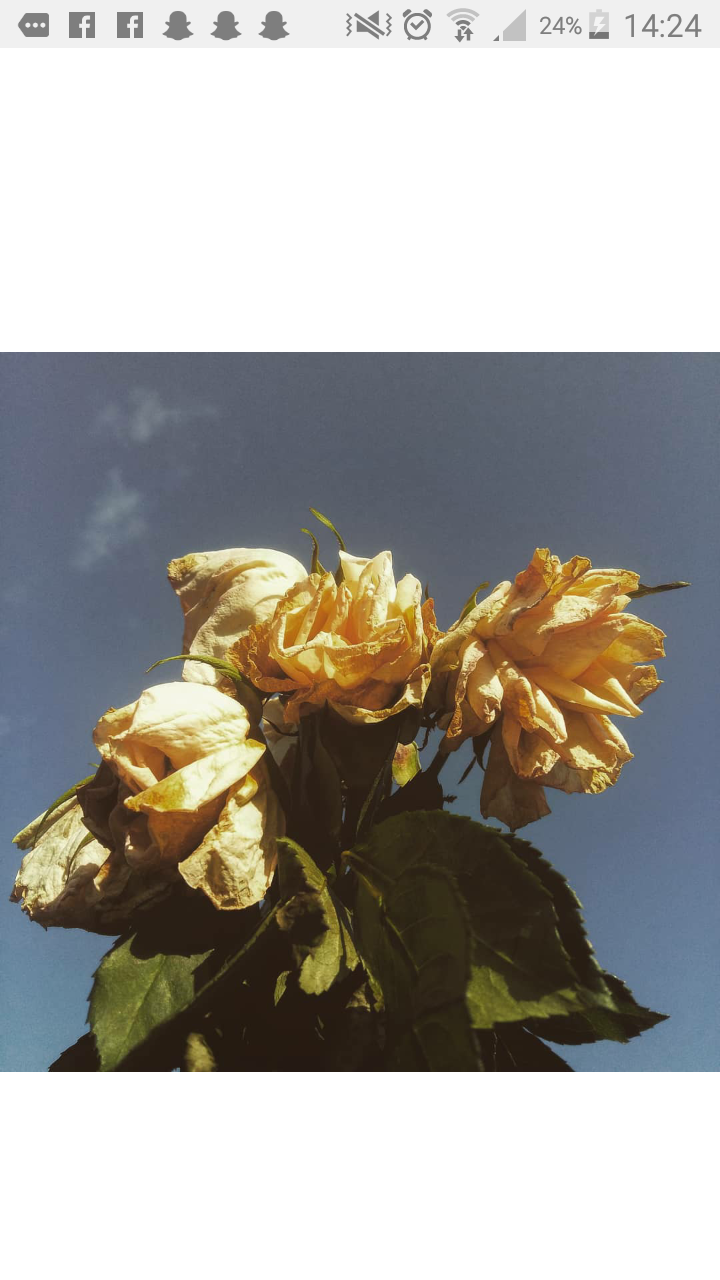
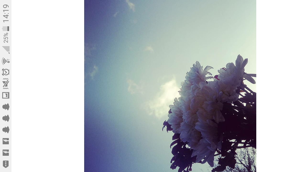
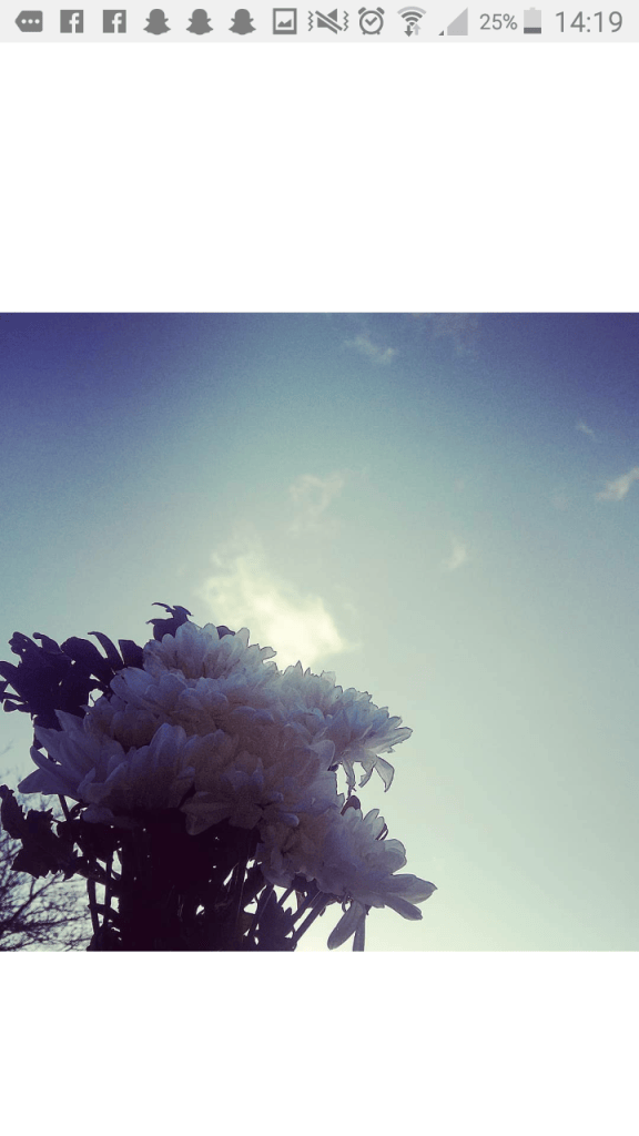
Nature photography. I love this photo as the light from the sky gives the flowers a glow and the shadow on the bottom left fades up towards where the light peaks most.
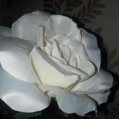
Abstract- As much as this photo look the same as the one above, this one is much more vibrant and the colours of the flower make the photo stand out. I really enjoy talking photos of flowers as every single one of them is unique and that’s what I love about them.
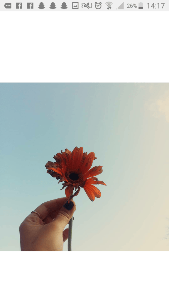
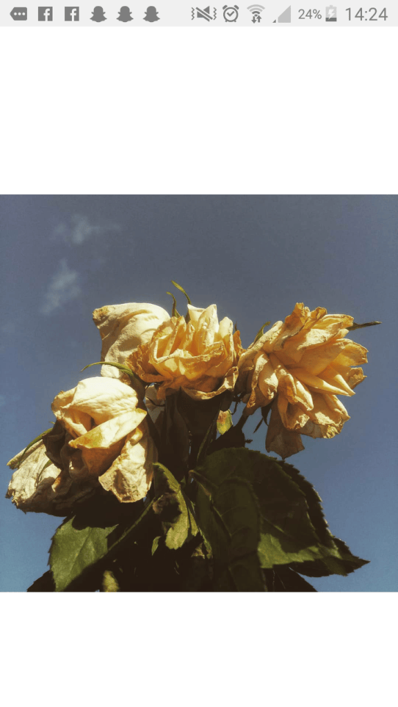
Nature-still life, I love this photo as it represents life as the flowers are warn out and yet it creates a beautiful photo and sends of message,I didn’t expect this kind of outcome but when i saw it I was very proud of my work.
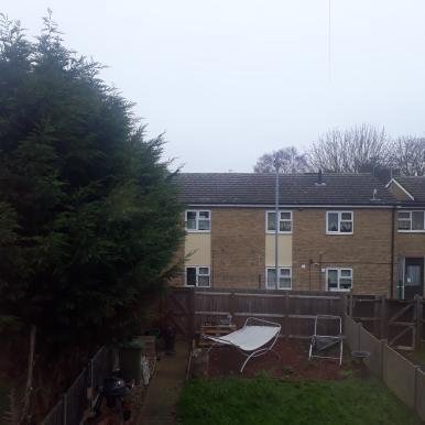
the genre on this photo is landscape it also captures the natrul positioning of the sunlight creating soft shadows and Sharpe highlights.

WordPress or Instagram?

Out of both of these apps i prefer Instagram as its alot easier to use and reaches out to more people as you can share your account and most people use Instagram than WordPress making it more successful to be seen by the public eye on Instagram

Instagram communicates me as a photographer as there are millions of different hashtag that you can use that communicate the kind of genre you use, which then the hashtags share your photo out to the people who follow that certain hashtag, unlike on WordPress not many people have it and it’s not as popular as Instagram. It also allows me to show of my work so much easier and express myself within my work and I can meet other photographers and look at their work over Instagram and get sharing them around etc.

However with WordPress you can write so much and have it laid out alot nicer it’s also alot nicer to read as it’s not cramped up together like Instagram but I do prefer Instagram as your account and work is seen by much more people.

Composition of Square format

Compositional aspects of square format,

~Filling the frame-avoid having lots of empty space
Junxtipose-put oposites in picture ~circles work in a square
Single subjects center them – person eye in upper 3rd frame
Intigraite lines/geometry -long lines different shapes
Make things semetrical

~Properties of square
Stable shape -square format
Square-center things
Cut out all extra bits
Creativity

~A frame within a frame- a square within a square
Another element of interest -frame within a frame
Circles-juxtapose-softens up photo
Sideshots-one side of frame
Rule of thirds
Diagnals-corner to corner of photo
Rule of three-
Space restriction-not allow space in square format
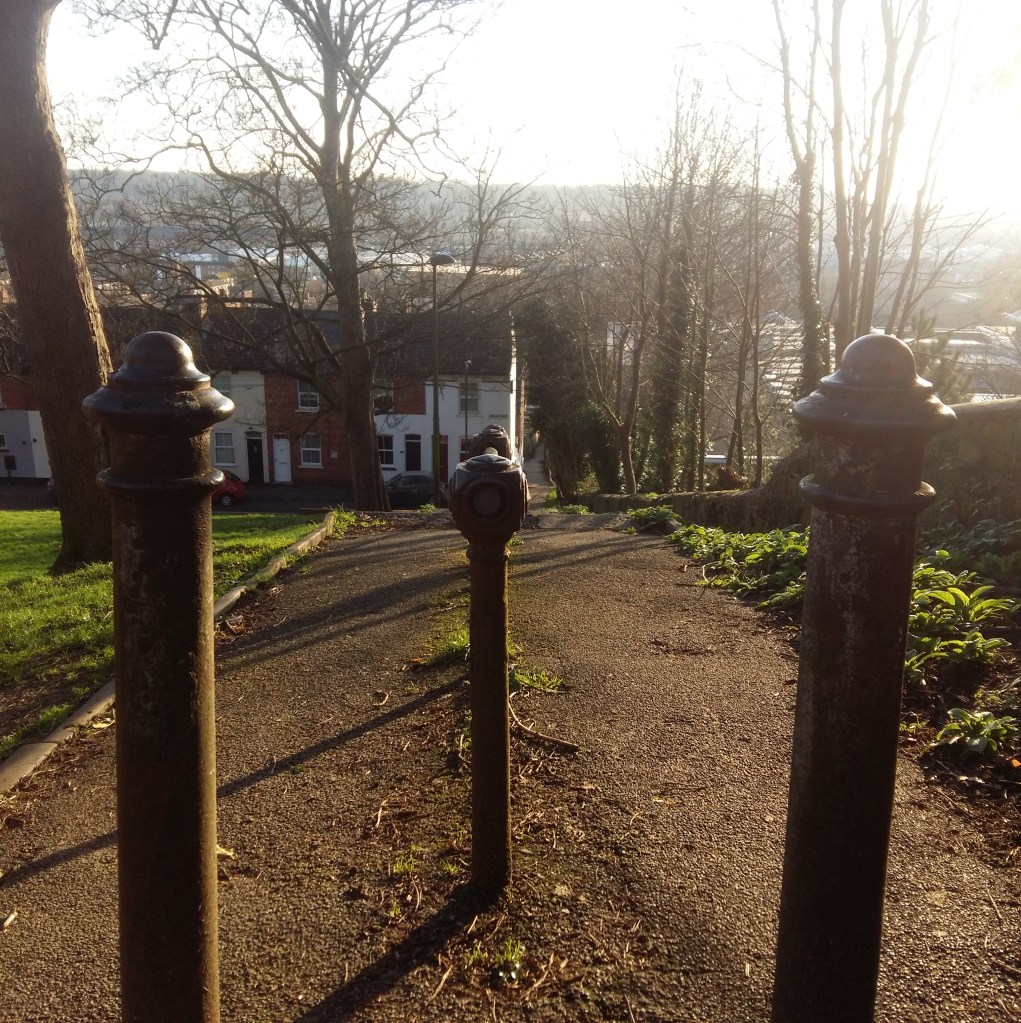
when using square format it works alot better when using 3 things instead of two, its alot more affective aswell as having leading lines that lead up to the horizon lines which directs the vewiers eye all around the whole photo, the photo is very effective as there is no space restriction making the photo full of detail and attract the vewiers eye.
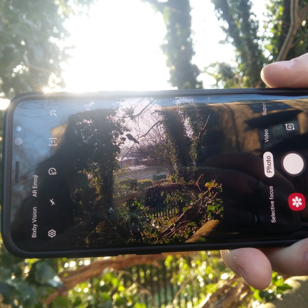
this photo has no space restriction and every bit of the photo is filled up with something to look at as in the background the light that shines creates a beautiful blurr on the trees to then you see on the phone the full bold details of the trees. the way all the features in the photo stand out and are presented catches the veiwers eye and attracts them into the center where the main focas is.
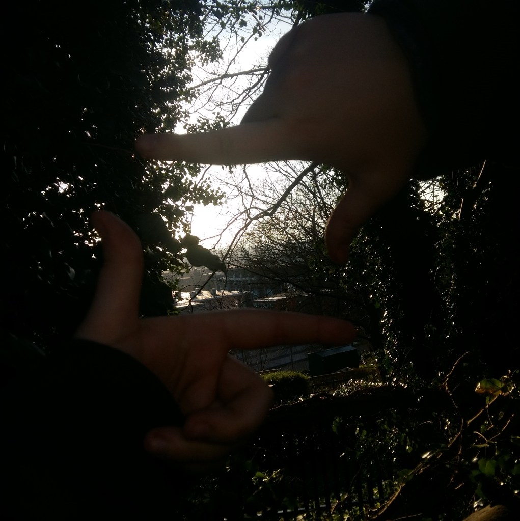
This photo is a frame within a frame it also has very little space making the photo more effective however to improve this photo I would make sure the angle I take it from will have better lighting as this is a good photo but it is quite dark and that is what I do not like.
This photo I like as it’s not to full it’s nice and even and not over the top and not filled to the brim with objects which makes it different from all the other photos, the horizon like is not dead centre and the building and trees are perfectly lined up which is effective to the vewiers eye.
This photo has leading lines but it’s not perfectly straight it sort of bends in a way which I really like showing the fact that it’s a hill, I like the fact the lines lead you all the way into the photo showing the qwurky and unique features of the buildings. The square format brings out the symmetry with-in this photo making it attract the attention of the veiwer.

Design a site like this with WordPress.com
Get started